Metric tracking and reporting provide a way to visualize a program’s effectiveness and success. Information can be gathered to look at the program from a high-level, and these reports are often pre-built and defined, such as those included in OncoNav’s Reports Plus module. Many navigation programs, however, may need additional granularity with more detail than may be provided in those predefined reports. Ad-Hoc reporting in OncoNav allows for the creation of custom program-specific reports using data that exists in OncoNav to monitor productivity, timeliness to care, metrics necessary for accreditations, and more.
Ad-Hoc Reports
Ad-hoc reporting in OncoNav allows you to create a custom report with documented fields from the OncoNav database using filters and lists. The data retrieved can then be displayed in tables and graphs for presentation ready reports. To explain this in the context of an example, we’ll walk through creating a simple report that shows how many patients are being actively navigated by their disease type, phase of care, and navigator at one facility.
By that statement, we are interested in five pieces of data:
- One defined facility
- Navigation status is ‘active’
- All disease types
- All phases of care
- All navigators
Filters
OncoNav Ad-hoc reporting uses filters to refine the population of patients for which to pull data. The Filter Manager window allows the user to select documented data in the OncoNav database and then to define criteria using the values available for that data. Per the image below, we have defined a filter that will include only patients being actively navigated at ‘Teaching Hospital’. Any patients that do not meet the defined filter criteria will be excluded from this report. If we wished to include all navigation statuses, we would not have included that in our filter. Adding that data item with all available criteria included would not have filtered the patient population but instead would add confusion for the person creating the report. Also notice we did not include navigators, disease types, or phases of care in our filter. We’ll expand on that further in the section about Lists.
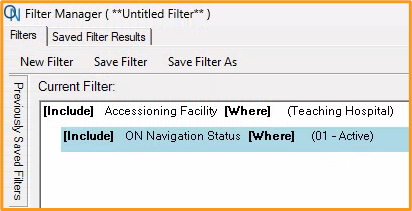
Filter Manager
Lists
Now that we have defined and narrowed down the patient population for our report, we will add the data we want to see in the report. In the top left of the List Editor image below, we can see that our filter returned 36 actively navigated patients. We know that all the patients in the report will meet these criteria, and we do not need to see navigation status displayed in the list. The data items we do want to see in the list, however, are the disease types, primary navigators, and the patients’ phases of care, so we will add these fields to display that data. Adding data items beyond the purpose of our report can appear to duplicate patients as it adds additional rows to accommodate the data items requested. So be sure to only include the data items pertinent to this report.
Also displayed in the top left of the List Editor image below is the number of primaries, or disease types, for the patients included in our report. Several of those 36 actively navigated patients have multiple disease types with unique navigation statuses and phases of care associated with them.
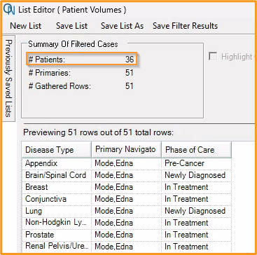
List Editor
Frequency Charts
OncoNav Ad-hoc Reporting includes report functions for presentation ready reports. One of these functions allows you to create a frequency chart for one or more data items to see how often something occurs by counts and percentages. Using the report list we created, we can view frequency charts as bar or pie charts for the number of actively navigated patients per disease type, primary navigator, and phase of care. For example, how many patients the breast navigator actively following that are currently in treatment versus those newly diagnosed.
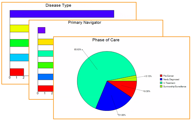
Sample Frequency Charts
Cross Tabulations
While the frequency chart allows you to see specific data for one data item at a time, a cross tabulation allows you to see two data items together. Using the data items in our list, cross tabulations could provide leadership additional information about each navigator’s patient volumes by disease type or by phase of care for actively navigated patients.
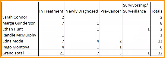
Sample Cross Tabulation
Exporting for Analysis
If the frequency charts and cross tabulations do not provide the level of analysis needed, the data in our report could be exported to Excel. This would pull all the data from our list, regardless of how many columns there may be, to have more functionality and use of the data as it would exist in Excel. This could include pivot tables and other charts or graphs not readily available in OncoNav.
Thank you for taking the time to read more about custom reports using Ad-Hoc Reporting. For more information about this and other reporting options available in OncoNav, please reach out to us at support@onco-nav.com. If you’re not a current client and would like to see a demo, please email us at sales@oncolog.com or click the link Schedule a Demo from the Onco website.

Oncology Data Management Software That Makes a Difference.
Enhance workflows while delivering quality information.